Building a website: Should you be asking what it costs or what it’s worth?

One of the most common questions I’m asked when I meet potential new clients or even when I just happen to mention what I do is: How much does it cost to build a website? This is normally followed by a statement such as “I don’t need a big site such a few pages” or “I’ve been quoted £3000 for a website, it seems a lot”.

Should you be asking about cost before value
Costing up a website can be bewildering so ask for skilled help

The fact that this is such a difficult question to answer but such a simple one to ask is no doubt the cause of many a headache of web development agencies all over the country. The fundamental challenge with the question lies not just with the ‘How Long is a piece of string’ nature of the question, but around the perception that creating a web page is easy because there are so many tools out there which provide templated solutions..  (I’ve blogged on the pros and cons of this before)… and to some extent, yes, it is easier than ever to build a website but this doesn’t mean it will add value to your organisation.

The harder question is how much is a good website worth to your organisation. A well designed website won’t just drive traffic but it will turn visitors into customers and generate sales and/or revenue for your organisation. A poorly designed website may have the opposite effect. The skill is not always in the building a site but in the thinking behind it and the bringing together of many talents to grow your business online.

Bob the Builder
Whether it’s Bob the Builder or your local plumber you expect to pay for qualified skilled tradesmen, building a website is no different

If you were to ask a plumber to fix a leaky pipe or sort out your boiler you would be paying a skilled tradesman for their time at a cost which could range from £30 per hour to £60 or more per hour depending on the job being done. e.g. a job requiring a CORGI qualified plumber is likely to cost more. It is very similar in the world of building a website.

To illustrate the costs of building a site a bit better let me give some ball park figures for the staff costs for a small site with no added gadgets or e-commerce functionality:

– a web designer can cost between £200-400 per day depending on experience (and location!), this equates roughly to a rate between £25 and £50 per hour. It can take anywhere between 1 day and a week to come up with and agree concepts for a small sized site (depending on the subject matter & complexity). Averaging this out a cost could be £800 – £1000

– This then needs to be built and depending on whether you want a site you can update yourself, and the level of analytics etc you want behind it, this could be between 1-3 days or more, but let’s say it’s just a simple site and £500

– You then need text, images and the site to be tested before you can even think about going live. Say another £100-£200.

Without even thinking about the cost of pulling the above work together, or non staff overheads you’ve spent approx £1500… and this doesn’t even look at the cost of items which would really add value to your site such as

  • user journey mapping.
  • a strategy to help you maximise value from your website.
  • content written by a professional copywriter.
  • cost of graphics tailored for your website.
  • functionality to encourage users to return or transact on your site such as blogs, e-commerce functionality, or discussion boards.
  • mobile compatibility
  • ongoing measurement & analysis of visitors using the site, and recommendations as to how to get more value.

All of these things take more time than that listed above, and all of a sudden spending £3000 on a well designed, functional website which you can keep up to date yourself and which will encourage people to do business with you seems like it might be cheap!

When businesses are struggling with recession, and start up organisations are struggling to find money to get off the ground I can understand that spending any money on building a website can be difficult. However, I would argue that it doesn’t matter how much or little you spend on your website if you don’t get value out of the end result; the first step is to ask what a website can do for you and then approach an expert to find out how to make sure that is what happens.

To get advice on how your website could be adding more value contact Saja Ltd

Are your users always right?

I have a fairly fundamental belief that your users and your customers needs should be at the heart of any website. If the people that the website has been built for don’t like the website and don’t find it easy to use then they won’t come back and use it again. Websites should support their customers in achieving their goals. This is a principle which was at the heart of the project I ran for Age UK but which has been key in the websites I have worked on across my career.

I am a huge advocate of User Testing and have really enjoyed working with some great usability companies who have time and again upheld my belief in the importance of this step in web design projects. You would think then that I would also believe that when it comes to feedback on design changes that users are always right, but this is not necessarily the case. The challenge is that people don’t like change, even if the change is for the better. This may sound a little contradictory to my statements above but I have time and again seen it when you carry out user testing with regular users of a site versus new users of a site:

  • When new users to a site are shown an old version of the site and a new version which has been designed with the user journey in mind, if the site has been designed well then the new site will usually be preferred. They have no preconceptions or user journey to unlearn.
  • When existing users to a site are shown an old version of the site and a new version of the site their previous experience will impact their decision. They may be expecting content to be in a certain place having ‘learnt’ that it is there, and they have to ‘relearn’ the new version. This can initially make a site seem less friendly.

Users don’t always know what it is that they don’t like about the new site and are not always as clear about why they are finding it difficult. This in itself suggests that the problem is not with the new site but in that they were used to something else. The phrase that sticks out in their feedback is often “it’s different” or “why has it changed?”.

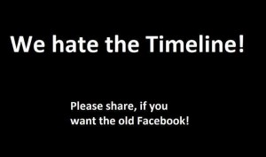
We hate the Timeline Facebook Share image
We hate the Timeline – an image currently being shared on Facebook in objection to the recent changes to the user interface

For long established sites this creates a real challenge in progressing change without frustrating the existing users, and I believe the key here is communication. The most visible case of this at the moment is on Facebook where there seems to be a large number of users sharing the “We hate the Timeline” image from Occupy Wall St’s profile. I have asked friends who have shared this image why they don’t like the Timeline and they find it very difficult to tell you why. I am actually fairly neutral in this debate, and can see real value for organisations in the Timeline interface, however I shouldn’t be surprised to see it’s created such a huge backlash in the general user base. It is a big change and I believe it wasn’t well communicated what was happening, when it was happening or why. This has left the majority of the Facebook users confused & upset.

So are these users right or are they wrong? Well without wanting to sound like I’m sitting on the fence I don’t think they are right or wrong, I believe the key is in understanding: understanding the challenges in learning a new site for both new and existing users, and helping all users to understand any changes being made.

As digital experts managing web projects, and as designers, we need to work with experts and work with users to try and balance this difference of opinion, introduce change in a controlled way, and ensure that resistance to change doesn’t stifle innovation and long term improvements.

What do you think? Have you encountered resistance to change within your organisation or your user base and how have you overcome it? 

Technology and web access has never before been so much on the move….

Anyone who uses trains or planes to get from A to B wouldn’t be surprised to learn of the increasing use of mobile platforms to access content online. Never before have you seen so many people sitting in close proximity staring at so many different types of screen: mobile phones, web phones, laptops, tablets, e-books… the list seems endless.

It doesn’t seem to be that long ago that when you talked about your organisation being ‘mobile ready’ you were referring to the fact that you had a website optimised for mobile phones (a .mobi intead of a .co.uk) but in today’s increasingly fast changing world that is no longer really enough – and I would suggest its not necessarily a wise investment either.

If you refer to mobile usage now you need to think of mobile in its truest sense of the word: people on the move. People on the move have a different set of needs to people sat at a desktop and we shouldn’t think of the term mobile as being a device, more that mobile is a circumstance. For example someone could be on a large screen laptop with free wi-fi in a coffee shop and intend to spend the morning there (I’ve done it myself often enough) – would they be considered to be a mobile user? And increasingly it seems we are also using our phones or laptops in the home to tweet, read or work, whilst sat in front of the other big media device of the century: the TV. In fact I’m doing so now.

For me, if you are supporting the needs of mobile users you should be thinking about the reason they are accessing the web in the first place, and the various constraints that they may be encountering. For example, if someone is ‘on the move’ then they may have bandwidth issues, limited time, restricted screen size, or be in a crowded place. All of these factors will influence the users behavior when interacting with your site. If your organisation is a shop then your ‘mobile’ users could be looking for a map, directions or contact details to help them find you. If you are offering advice then is it accessible in a way that can be easily navigated to and read in bite size chunks. If your users are customers who need to access account details then what are the details they will really need when they are mobile, and how can they access them?

None of these concepts require specialist technology to support the users needs, it is all about clever information architecture – where you put information on your site and how your users navigate to it – and ensuring that the user journey works for all types of users.

It can also be argued that with a new mobile gadget being released every few months, is it realistic to redesign your site for each and every device? With this in mind accessible and user focussed web design and best practice has never been so important.

I’m not saying that sites built for a specific device with a specialist technology don’t have a place – in fact if your audience is only using one method to access your information then it makes total sense to optimise it for that browser or device… and if you are creating a short shelf life pieces of functionality then there may be some really great cost or experiential reasons for developing it in a specific way.

Never the less if you are looking for ways to reach your mobile audience I would argue that if you consider your core user needs, and lay out your website in the most appropriate way for these needs, and if you use technology that works across all devices, then you will reap the returns of having a site that people can use from anywhere.